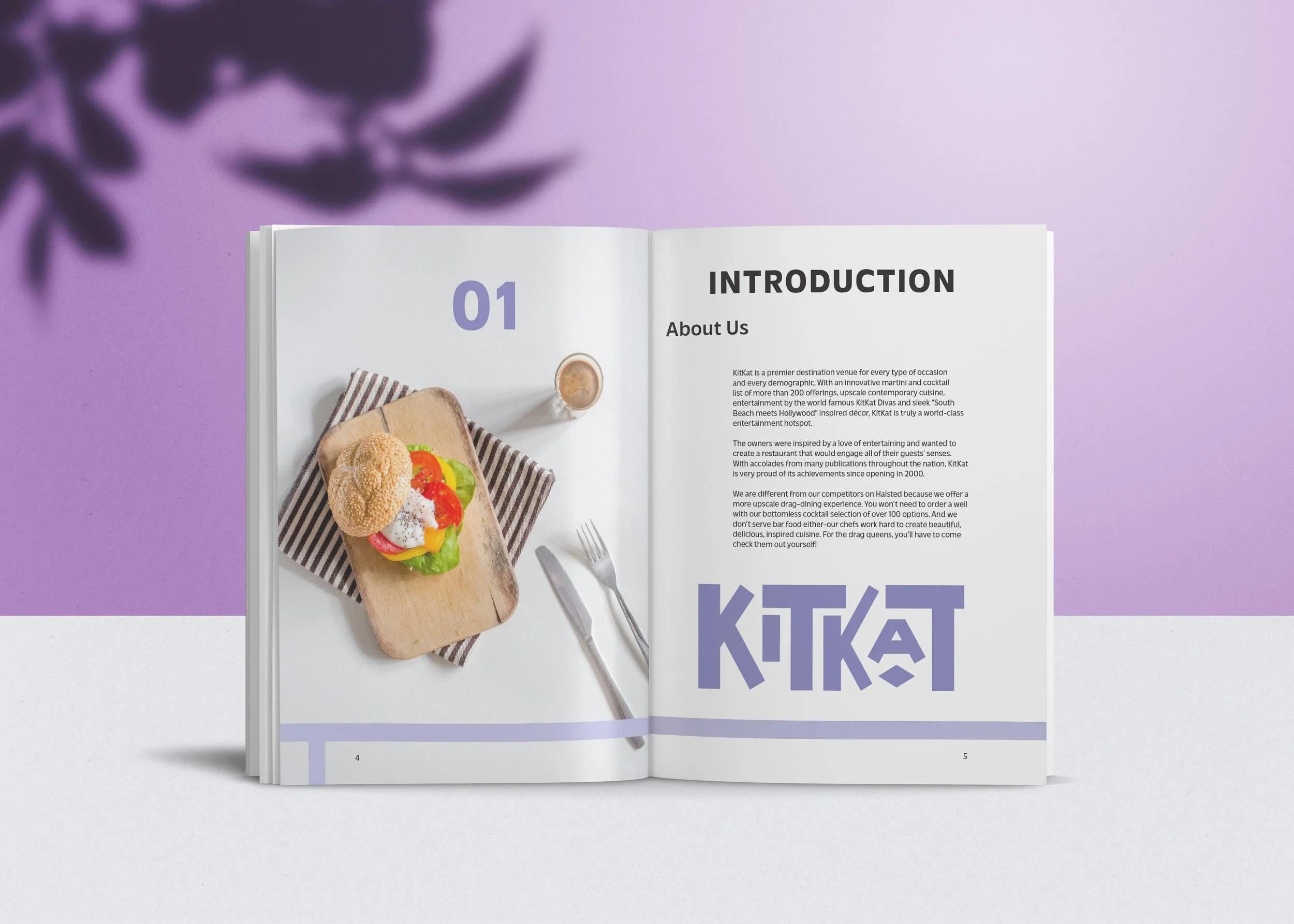
Kitkat offers a unique cocktail list, plenty of delicious food, and back-to-back showstopping performances. Other restaurants and bars in its market have a single name and stronger mark that give them a fresher feel. I wanted to move away from the green color, round shapes, and script font to emulate the fabulous vibe that you feel when you’re at Kitkat. I played with the weight of the letters, the white space between them, and the length of various parts of each letter come up with something a little bit funky yet very structured.
They describe their drink and food as “cocktails and cuisine,” and everything has a detailed garnish. The decor in the restuarant is bright, shiny, heavy-metal and reflective which gives it another elegant feeling. The performers are proffesional, interactive, and high-energy. Purple is meant to eminate a regal and creative tone that Kitkat has to offer. I chose to include the diamond mark from the original logo to break up the spacing and lettering, and it turned out to be a fun secondary element in designing other elements.
APPLICATIONS


